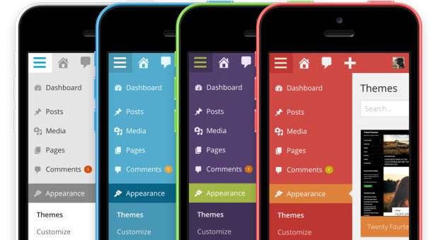
WordPress 3.8 is now available via Softaculous. Upgrade your existing installation to 3.8 with one click or install a fresh new blog.
WordPress has gotten a facelift. 3.8 brings a fresh new look to the entire admin dashboard. Gone are overbearing gradients and dozens of shades of grey — bring on a bigger, bolder, more colorful design!

Modern aesthetic
The new WordPress dashboard has a fresh, uncluttered design that embraces clarity and simplicity.
Clean typography
The Open Sans typeface provides simple, friendly text that is optimized for both desktop and mobile viewing. It’s even open source, just like WordPress.
Refined contrast
Beautiful design should never sacrifice legibility. With superior contrast and large, comfortable type, the new design is easy to read and a pleasure to navigate.
WordPress on every device
We all access the internet in different ways. Smartphone, tablet, notebook, desktop — no matter what you use, WordPress will adapt and you’ll feel right at home.
High definition at high speed
WordPress is sharper than ever with new vector-based icons that scale to your screen. By ditching pixels, pages load significantly faster, too.
Admin color schemes to match your personality
WordPress just got a colorful new update. WordPress 3.8 includes eight new admin color schemes so you can pick the one that suits you best.
Color schemes can be previewed and changed from your Profile page.
Refined theme management
The new themes screen lets you survey your themes at a glance. Or want more information? Click to discover more. Then sit back and use your keyboard’s navigation arrows to flip through every theme you’ve got.
Smoother widget experience
Drag-drag-drag. Scroll-scroll-scroll. Widget management can be complicated. With the new design, WordPress team has worked to streamline the widgets screen.
Have a large monitor? Multiple widget areas stack side-by-side to use the available space. Using a tablet? Just tap a widget to add it.
Twenty Fourteen, a sleek new magazine theme
Turn your blog into a magazine
Create a beautiful magazine-style site with WordPress and Twenty Fourteen. Choose a grid or a slider to display featured content on your homepage. Customize your site with three widget areas or change your layout with two page templates.
With a striking design that does not compromise our WordPress’ simplicity, Twenty Fourteen is the most intrepid default theme yet.


